|
|
Post by Asila on Jan 7, 2009 4:17:35 GMT -5
Finally, I've drawn something new! It's been a while. Aaaanyways, I've been thinking of Evening a lot, so I decided to make an attempt at drawing her. I'm so happy with this picture! *squeals* Though I probably shouldn't get so excited, because I still have to color it. And since I have my heart set on a background, and I'm not good with backgrounds, I'm feeling kind of daunted.  (It's title, when I get around to posting it on my deviantart account, is going to be "It's all right, you're free now..." I bet Evening broke that chain herself when she decided to free the poor wolfie.) I had a few issues with the line art (due more to my gerbil's attention span and the resulting impatience than anything else) and the chain looks kind of retarded, but I am very pleased with myself nonetheless. I have drawn less than five people in the past two years, since I generally consider myself a failure when it comes to dealing with the human figure, but this turned out great! Of course, part of that might be because she is half wolf in this one... As for hands...well, I need to fix some of the mistakes I made while penning them in and I really wish I had some sort of graphics program on my computer to work with, but, if you can look past the mistakes, they turned out pretty good, too. Yet another miracle. All right! Now, on to the unfinished Lief pic!  This one needs some explaining. The reason it's half finished is because I began to have problems with color scheme. (Just for the record, I was using the tawny yellow to try and give the paper an old parchment look, but I haven't been entirely successful yet.) The issue is that, while I was attempting to shade Lief a silver-white, I fell prey to my love of dramatic shading effects and now I'm afraid that it's beginning to turn into another kitsune entirely. I'm going to have to bug Seven about this. Surely there is some color I can use to add the contrast that I love! (since the silver doesn't seem to be working...) |
|
|
|
Post by Rojo on Jan 7, 2009 11:20:47 GMT -5
*Eye twitches*
That's what she looks like? Oh dear. I suddenly have to go and erase and re-draw about three drawings now...
Anywayz! Dese is teh gud stuffz!!1one!11!1elven1!
i liek dems cuz dey r kewl and evening luks like a fae!
|
|
|
|
Post by Asila on Jan 7, 2009 17:56:43 GMT -5
*grins* She kind of does, doesn't she? It makes me glad I decided to throw in the wolf ears even though they weren't part of her original description.
And don't feel like you have to re-draw the pictures you've drawn! Especially since I keep changing my mind about her! In fact, I originally planned on having her hair shorter. Too short to tie back, in fact. But I thought she looked so cute with long hair in your picture that I decided to compromise a bit and make her hair longer in my picture. So it's not a big deal if your pictures don't match up exactly with mine. Especially since she'll soon learn to shape-shift with more skill and won't always have the wolfish lower body that she'd been stuck with for all of her life so far. You'll see.
Also...I can't believe you've been holding out on us! Three more Evening pictures? Three? And you haven't scanned them yet? Well, why not? *taps her foot sternly* You'd better have a good excuse, young man!
|
|
|
|
Post by Asila on Jan 8, 2009 2:57:47 GMT -5
Well, I finished coloring the Evening pic, and it turned out so beautifully that I think Seven should hit me for whining about it. *grins* Still, do you have any idea how many hours this picture took me? I think I spent at least six hours shading it and an hour or two on the outline. I was working on this picture all day today. It's the only thing I've gotten done.  Though I have to admit, it was worth every hour and every frustrated sigh. |
|
|
|
Post by Seven on Jan 8, 2009 11:48:12 GMT -5
Oh wow! It's so beautiful! I love it (actually them, except I'm responding to your finished Evening picture first.) Rojo was really right on the dot when he mentioned Evening looks like a Fae. But really! Shame on you for claiming that you can't draw people! You do them really well! Evening looks really great, and the color really enhanced everything! Her hair cut looks so cute too! A little long, pretty, but messy in a sort of feral, I-live-in-the-wilderness-and-talk-to-animals, way. Your coloring is also (as always) amazing. The choice of blue for clothing is so pretty. It really makes Evening pop out of the picture with all the greens. It looks really good. And I love how you hsaded her tail and hair. (It looks so fluffy....She wouldn't be too offended if I pet her, would she? lol.) I don't know why you were complaining about the wolf either. It looks really cute and sweet as well. And the background! I love how the morning light is filtering in through the trees--the beginning of a new day? It seems to be the message, especially with the freeing of the wolf. I've always really liked that type of forest look though. The sillouttes of tree barks with light hitting them from the back and shadows extending forward. Oooh, it's so pretty! *glomps*
And you drew Lief! He looks so pretty! I love the pose you put him in! It's so reminiscent of ancient Oriental scrolls that portrayed mythological beings. And you did the tails so well! Whenever I try to doodle Lief as a fox, I never know what to do with so many tails! You on the other hand, seems to have that down! As for the coloring...try to go with the colors in that old chibi avatar of Lief except for the ears. He's entirely white except for the tips of the tails, ears, and paws, which have that slight reddish tone. (While the chibi avatar had such a thing for the tails, it didn't have a similar fur pattern for the ears...) I was about to go into why this is...but that's a whole other story and I don't feel like ranting on a practically unrelated topic for now.
|
|
|
|
Post by Asila on Jan 8, 2009 15:36:38 GMT -5
*has now had the half an hour it took her to fall asleep to dwell on the flaws of this picture* She does not look great! I'm convinced now that her eye didn't turn out well at all, even though I tried to shade it in a handful of different ways to get both the expression and the look I was going for.
...though the wolf turned out really good. But I've had a lot of practice drawing wolves. Though, for me, a lot of practice is only about eight pictures. And I draw wolf eyes all the time, because they are so intense.
And the forest did turn out well. I had one of Creed's songs running through my head, and I happened to conveniently mishear one of the words in the main chorus.
With arms wide open
Under the sunrise
Welcome to this place
I'll show you everything
That song has been stuck in my head ever since I finished the line drawing.
All right, I think I recovered from the worst of my doubts regarding this picture. But don't I still get to whine about how I struggle with people? At least?
And I also really loved her hair style because it looks both wild and pretty at the same time. I had a horrible time trying to decide on the colors for the outfit, though. But there's no point in whining about that, since I got it right in the end.
You know, drawing nine tails was really, really tricky. I'd never drawn a creature with more than three before. I just got the basic drawing mapped out a couple of weeks ago, then I touched up the tails when I got back to it. And his expression, since I didn't like how I had drawn it originally. He didn't look clever enough, at first. I'm still not sure I got it exactly right now, but I think I'm at least close.
I had no idea that mythical beings drawn on scrolls looked like that. I was just going for a stance that was dynamic yet elegant as well. And I think his tails kind resemble a stylized lotus blossom. I was even thinking of drawing a lotus blossom in the opposite corner, to reflect this, but I decided against it in the end. Perhaps, in that corner, I could have the Japanese character for kitsune and cherry blossoms. Or small lotus blossoms, as opposed to the big one that had been the original idea. Hmm...
And I'll have to get to work on the red points right away. I'm going to have fun with this. I haven't done a color scheme like that since I invented my version of a fire cat, and it has to be one of my favorite color combinations. *loves red*
|
|
|
|
Post by Seven on Jan 8, 2009 17:22:19 GMT -5
Don't make me have to hit you with the Buddhist compassion beating-stick. I will! *waves the paddle-stick-thing around*
But really, the whole thing looks great. I don't know why you're being so knit-picky about nothing! The eye looks good. The only thing I can think of that might have given it that 'look' you wanted was if you had a dot of shine to it. That tends to give anime-styled characters a slightly more focused look to their eyes.
*grins* Weren't you just saying last night that you didn't like how the wolf turned out? You're so funny Asila. Thouhg I'm glad you agree now. And yes, the forest is amazing. I love the tones of greens and yellows you used. It looks so alive.
Pretty lyrics, but what did you mishear?
No, not allowed. No whining that you can't draw people. You obviously can. *grins*
Yes! I love her hair style. I actually wanted to put it into a pony tails the first time I drew her with Molly in the tango picture, but you had said it was short, so I didn't....But I absolutely love it! And the outfit is so cool. I get the idea that it's supposed to look worn and broken down after all the years in the forest, but it looks so cool. I'd wear it!
Chya, I can imagine. I have trouble with that many tails too. Usually I opt for "There are more but you can't see them" method of drawing. You've been working on a Lief picture even longer? I thought this might have just been spur of the moment since you never mentioned it! No fair! You're keeping secrets, lol! I'm curious to see your sketch now too. Either way, I really like this one that you did of him. It looks really good.
Yah, they do. Sometimes they have elaborate backgrounds if they're not on sepia toned paper like you were going for here, but they seem pretty similar to that. I actually wondered if you were going off of something when drawing Lief. I really love how the tails fan out that way. I hadn't realized it's correlation to the appearance of the lotus flower, but it makes a lot of sense, and it sounds so poetic! You're really incredible! If you want to do the Kanji character for kitsune, I could help you track it down...or at least the Japanese hiragana for Kitsune.
I'm glad you like the red color scheme idea. When I first designed lief, I was thinking about the silver as well, except it seems silver is used too much, and red is pretty. I'm glad you like it!
|
|
|
|
Post by Asila on Jan 8, 2009 19:00:08 GMT -5
You know, you really would have to beat me until I'm half-dead to keep me from complaining about what a terrible artist I am. And I'm not making any promises, even then. *grins* You know, I thought about adding a light dot to her eye, but I decided against it because it wouldn't look right. I mean, where would that light be coming from? The only light in the woods is the soft golden light that's filtering through the trees, and it's coming behind her. No, I think my first mistake was in the line drawing, which looked good as a line drawing but proved itself to be flawed while I was trying to shade it. Oh well, I'll do better next time. I have to mess something up a few times in order to get it right. Almost everyone does. I don't think I said I didn't like how my wolf turned out, I was just frustrated because I had to draw it so many times in order to get it right. And I still don't like the chain, but there is just no way I can draw a chain on such a small scale and make it look good. I still had a few issues with the wolf once I'd finished drawing him, but he looks great shaded. I especially love how bright his eye looks against his dark fur. That's another one of my favorite things about the picture. *nods* Creed has some beautiful songs out there. I like them despite the fact they're a Christian band. But the references are subtle so it usually doesn't bother me. The theme in the songs I've heard often seems to be redemption, which is a universal longing, not just a religious one. Anyway, when I mentioned mishearing part of the lyrics, it was just that I thought the one line was "Under the sunrise" when it's actually "Under the sunlight". I like my version more. I'm glad you like the outfit. I had a few misgivings, mostly about the skirt. I thought the shading looked kind of flat, but I couldn't use dramatic lighting effects because of the soft lighting of the scene. Still, no one else has had a problem with it, so it can't be as bad as it looks to me. Well...there isn't really another Lief sketch. I just kept working with the one I had until I thought I got it right. I had the tails down pretty much on the first try. I just had to straighten a few things out, like decide which tails would overlap where. Then I decided to place the middle tail on top and take it from there. And I redrew his head quite a few times to get the look I was going for. And I was having trouble with the back leg, so on the back of the opposite page I drew another fox (with only one tail to keep things simple) and worked a bit with paws and legs, and placement of the paws and legs. And I didn't tell you about it because it started off as a quick sketch that I wasn't taking that seriously, and then I found I didn't like anything except the tails, and I knew I had to redraw a few things but didn't really know where to start so I just forgot about the picture for a while. Then I felt kind of obsessive and fixed that picture up on the same day that I drew and penned in the Tallamous Evening picture, which is more than I've ever done in one day. Hooray for being restless! Well, I think I'll let you find the character that you like, because I don't know anything about different kinds of characters. I thought every Asian nation had it's own set and that was it. *shrugs* I feel ignorant. And yeah, the lotus blossom-esque shape of the tail is really cool. I hadn't really planned on that, hadn't really planned on anything at all, but I'm glad it turned out as it did. It does look as though it were based on an authentic Japanese illustration, whatever one of those would look like. I just realized that made no sense, because I've never seen an authentic kitsune illustration before.  |
|
|
|
Post by Seven on Jan 9, 2009 18:08:18 GMT -5
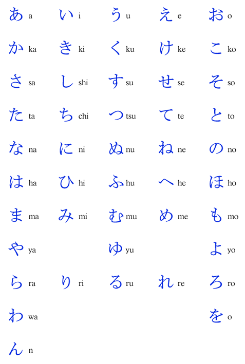
NOOOOOO--you can't complain about being a bad artist! You're a better artist than I am, so how am I supposed to feel? *grins* As for the light-dot in her eye, I thought all along it looked good without, it was just a suggestion since you apparently didn't like the eyes *crosses arms* As for where the light would be coming from...have you ever seen an anime that cared where the light is coming from? Even in scenes where characters are in the dark, they have light in their eyes! If you want a photoshop to edit your pictures, I can still install it for you. You'd just have to bring your laptop with you next time you come to my house. I should be able to do it then. And if that doesn't work....then you're clearly not fated to pirate photoshop! Really? I'm pretty sure when you called me on the phone two days ago, you said you didn't like the wolf too much. I never said you complained about it on here. Oh well, who knows. I personally always like your wolves. Wolves in themselves are beautiful creatures, and you always capture that. Ah, I see. You're right. Your lyrics are better! Oh yes, and you're funny for thinking Evening's skirt looks bad. Oooooooh, I see. So there was only one Lief picture. You didn't like anything but the tails? How much of the Lief picture did you redraw? Or rather, how long did it take you to decide on the pose? As for the characters of Japanese....well...there's a couple systems. Japanese people essentially stole Kanji from the Chinese. In China, there is an individual Kanji for each word--so that can be pretty confusing. Apparently the Japanese people thought that was cool as hell, so men/scholars would learn and write everything in Kanji. Of course, this wasn't very practical. Hiragana is actually the Japanese form of writing. It's means "Woman's Hand," because women/uneducated people used it. (The first Japanese book was written by a woman since all the Japanese men were writing in Chinese, interestingly enough.) Hiragana is a bit more like English. There are 47 (I think) characters that correspond to different sounds. Combining them in a pattern makes a word. (Here's a picture:  There is also Katakana, which is similar to HIragana, but is only used for foreign words (originally used to translate Buddhist scrolls into Japanese.) In modern Japanese, there is mainly a mixture of Kanji and Hiragana when writing. For example, a when writing a sentence, the subject of the sentence might be written in in Kanji, or have the first character of the word replaced by the kanji symbol and the rest of the Hiragana left alone. Anyways, enough about that. I figured the Kanji would look the neatest  |
|
|
|
Post by Asila on Jan 10, 2009 3:20:56 GMT -5
I am not a better artist than you are! I am a versatile artist, and seem to do well with any subject or material or style that I'm working with when I put my mind to it, but I'm not particularly great at anything. I wouldn't argue with me, if I were you. I'll never think I'm good enough until I'm one of the best. Good just isn't good enough for me. Besides, you're so good with people! You always seem to get the moods, stances, clothing, and eyes right, while I struggle with every one and always manage to screw something up.
And I've seen one anime that focuses on realistic lighting. Blood Plus. It's part of what makes the show so cool. The light effects are just incredible, and that show is a bit of a psychological thriller. The majority of it isn't very flashy, but it's intense. *frowns* I really, really have to order the second (and final) season. It's never at Best Buy.
Oh, now I'll definitely bring the laptop along when I visit you. (Is it too late to come down during winter break? Get back to me on that!) I can think of one problem, though. My new laptop his Windows Vista, not Windows XP. Would the programs be compatible?
*shrugs* I might have said I didn't like the wolf. I was very annoyed with the image at the time (since I'd just spent a couple of hours struggling with the background) and I was feeling kind of insecure. And while I always liked the wolf's head, the way it was tilted and his uneasy expression (that Evening is trying to sooth), I was afraid that I'd somehow messed up his body when I'd compressed it into space. That kind of angle is difficult, and it bothered me that one of his back legs was overlapped by his front leg. I know that the legs kind of fell that way, and trying to draw in the fourth wouldn't look natural, but it still bothered me. I try to be logical, but my insecurities and emotions tend to gang up on my sense of logic and lock it in a soundproof room while they rampage through my mind, leaving Logic to sit there and yell "Oh, come now! You're being absolutely ridiculous!" as loudly as she wants to but with absolutely no effect.
Uh, I didn't really change that much. *looks sheepish* I usually get the basics of what I'm going for right away, but the little things make a huge difference and that's where I have my problems. In the first sketch, Lief was in pretty much the same stance he's in now, but the drawing was still in it's early stages. His legs were just lines that I'd sketched out to get a sense of movement, and in my first attempt, it looked as though he were about to land, still suspended in the air, instead of actually landing. Also, from the way I'd mapped it out, his front legs were pressed forward, like a fox that's leaped up in the air to pounce on a mouse. And neither message was the one I was going for. Lief is a grounded, clever creature. Falling prettily through the air wouldn't suit him. And that predatory placement of paws compromised the elegance I wanted in the picture. So I moved the leg closest to us back a bit, and drew it so that it began to fold a bit beneath him as he landed, then lifted the other foreleg up in the air to give him a look of casual confidence. Kind of like the sweeping gesture of some of the gentleman I've seen drawn by other artists on deviantart, but in animal form. I didn't really change the back legs at all, I just had to redraw them on my practice fox (so that I wouldn't have to worry about erasing and then redrawing large portions of the multiple tails every time I erased a failed attempt) and, since I had more luck on my practice fox, I sketched the refined, improved version back onto the Lief sketch. The line of his body didn't really change at all, but like I said before, I had to redraw his head multiple times to get it right. My first try looked cute, and sad, and almost cat-like in structure. The next few attempts were too wolfish. Then I gave up and looked up fox pictures on Google so that I could get the shape of his muzzle right. And that worked. Then I got to struggle with his eye and it's expression. That was a joy. I ended up feeling frustrated, thinking "That's it! I'm done!", and penning in what I had while hoping for the best. I was kind of disappointed with the result at first, but the more I look at it, the more I think I got it right after all. It's kind of funny, how much thought I put into a simple design, isn't it? I even put way too much thought into the shape of his ears and even more thought yet into the design of his legs and paws. I usually give my cats and wolves thicker legs and bigger paws than the slender limbs and delicate paws I gave Lief. Those were a first. Oh, and his head was tilted downward in the earliest stage of the sketch, but I wound up having him lift his head. I think to add to the look of confidence. People who stare at the ground when they walk are usually either detached from the present reality or just lack confidence, while those who lift their head are more alert and seem to know precisely what they want and where they are headed.
And then I wonder why I get so angry while working on an art project. I expect so much but I never know precisely how to go about it, and the trial and error process tries my patience. And the fact that I have no clear idea what I'm going for while working on a picture doesn't help. All of the stuff that I've just explained were only vague, fleeting impressions while I was working on the picture, and they had a tendency to give me a sense of what I was doing wrong while giving no advice on how to do it right.
Oh, that makes sense, now. I knew that, in China, they had individual characters for every word, and I knew that the Japanese characters were a bit different because, in the Japanese magazines Melony used to buy, they clumped the characters together the same way we clump our letters together to form words. But I'd never really thought about it. But I also think that, for this picture, having one symbol would look better than having four. Can I ask you to re-post that image for me? It didn't show up...
|
|
|
|
Post by Asila on Jun 3, 2009 2:34:26 GMT -5
The Lief pic. After I invested 3 hours into shading it. I used colored pencils (of course) and I messed with these glittery gel pens that I have. So, in real life, this picture looks kind of like a holographic card. But, when I took a picture of it, the reflection of the metallic pens came across as speckled blue dots. *sighs* And this picture is gorgeous in real life, too.  (( A larger image. i42.tinypic.com/2drs7fa.jpg )) I can't even tell you how smug I am over this picture. I feel very proud of myself, for once. *smug grin* Lief looks fluffy. And I want to play with his tails. Because they're pretty. |
|
|
|
Post by Seven on Jun 3, 2009 14:20:30 GMT -5
*Glomps*
It was so worth every nanosecond of your shading efforts. It looks SO pretty and as always, your coloring makes everything look softer and fluffier and just lovely! I love how the red accents came out; it really adds a whole extra dimension to the picture and really makes the whole thing pop off the page! I only wish I could really see how the bits of glitter came out, but I'll guess that'll have to wait until next time.
Amazing job Asila, you are not allowed to critisize what your artwork at least for the next 2 weeks now!
|
|
|
|
Post by Asila on Jun 4, 2009 0:21:25 GMT -5
I told you that shading something in makes all the difference! That's why I hate to post something on my deviantart account until it's colored in. Far more people would check out a finished Lief image, with it's striking color-contrast, vibrant hue, and interesting texture over a mere outline.
And that's also why you make me sad when you don't color in your pretty pictures. Because if they look that cool as a line drawing, then they'd have to be wonderful beyond what I am able to imagine finished.
As for the glitter, it's subtle because the pens were pretty cheap and I layered them over the already thickly layered colored pencil, but it's kind of cool because the whole thing shines when you tilt the page. That, and the silver pens make Lief appear more silver than he does in this image.
Hey, if you tell me I can't criticize my work, then I'll only get sneaky about it. Like how I was about to say I wanted to draw a more realistic version of Lief with subtler red tips. Since I know the red wasn't supposed to cover his entire ears or his entire muzzle. I just got a bit carried away. And I think the red on his legs would look nicer if it gradually faded into white/silver instead of cutting off rather abruptly. And I had a cooler shading idea for the tails, but only after I was already halfway through with them.
|
|
|
|
Post by Seven on Jun 4, 2009 9:51:11 GMT -5
*sighs* Yes, yes, I know, I should be coloring in my pictures because it looks better and people like that more, and I would like the finished product more....But these days, apart from the time constraint, it's hard for me to even do the line art, much less the repetitive task of pressing into the paper with colored pencils to color; that might just kill me. *wry grin*
As for the glitter pens....Aww, that sounds so cool! I mean, you wouldn't want a heavy layer of glitter-gel pens anyways, mucking up the long time you spent on the colored pencils, but the fact that they came out subtle enough that they just make it seem holographic and shiny makes it seem so much more pretty! I still can't wait to see it.
....Okay....what if I tell you that you can still critize your work (in a healthy fashion) to keep improving, but you're not allowed to get all depressed and say everything you draw sucks?
As for doing a more realistic Lief.....that also sounds really fun (to me, at least), though I still love how you did this one. True, the red was supposed to be a bit more subtle, but I thought it was fine because of how nicely you did it. Still, you don't need to go gallivanting off to do the next Lief right away, but if you intend to do him again, the red on his nuzzle is supposed to be really faint, more like his whiskers are red than anything, the ears and legs should only be tips and paws, and the tails look really good. However, I am really curious about your cooler idea for the tails; what is it?
|
|
|
|
Post by Asila on Jun 4, 2009 23:44:42 GMT -5
But...but, sometimes, when doing line-art becomes more of a chore than fun, coloring pictures becomes more fun. Because then you're still doing something, which means you get to feel productive, and you don't have to think as much about design. Not to say that there aren't any design elements in coloring a picture. It just seems to me that as long as you know what you want to begin with, the details work themselves out as you go.
And besides...*creepy, lyrical psycho voice* colored pencils are your friends, Seven. They would never hurt you... *pulls a curtain around the fiends cookbook that sits on a table with a miniature of the device used to animate the Frankenstein monster*
Oh yeah, you must see the original picture. The photographed image just doesn't live up to it. Which reminds me...when will I see you again? Are you coming with Pan and Aka when they travel to Wisconsin on the twentieth (or something like that *can't remember dates*)?
Yep, you can tell me not to get all depressed over my artwork and claim that it sucks. I can only feel immensely critical over one thing at a time and I am now sufficiently distracted. *nods*
As for doing a more realistic Lief.....that also sounds really fun (to me, at least), though I still love how you did this one. True, the red was supposed to be a bit more subtle, but I thought it was fine because of how nicely you did it. Still, you don't need to go gallivanting off to do the next Lief right away, but if you intend to do him again, the red on his nuzzle is supposed to be really faint, more like his whiskers are red than anything, the ears and legs should only be tips and paws, and the tails look really good. However, I am really curious about your cooler idea for the tails; what is it?
Yeah, I feel bad about going too far with the red. And I didn't even notice until I was already half finished. I was just so determined to finish the image and make it look nice that I kind of...neglected to accurately represent the details. *sheepish smile* As for the alternate color scheme for the tails...well, I discovered that the darkest shade of red I was using looked really good when I only outlined the waves in the fur at the end of the tail and only shaded it in minimally. I switched techniques multiple times while I was shading the tails, because nine gets repetitive, and when I saw how the darker red looked as a much subtler accent I regretted my previous shading decisions regarding the red. In fact, it was at that moment that I really decided to draw a better Lief pic so that I could base my entire technique around that tail that I had only just begun. So the tails will have less red, too, and I'll keep your other recommendations in mind. I think part of my problem was just that, when I think of creatures whose extremities are a different color than the rest of the body, I think of the color scheme of the Siamese cat. Which is kind of what went wrong, here.
As for just having red whiskers...I don't know if I'll be able to pull that off. When you're working with colored pencils, it's really hard to emphasize thin lines so that they stand on their own. I'll try out a few techniques on a fox sketch or two, but I might end up just tinting the end of Lief's muzzle red. I'll figure something out.
...though it probably will be some time before I begin a second Lief pic. Especially since there is still more I want to do with the first...
|
|


